
Have you ever tried navigating your own website… with your eyes closed? While it might sound peculiar, this experiment can provide a startling insight into the world of accessibility. In the online universe where we’re accustomed to speed and convenience, it’s easy to forget that not everyone shares the same experiences or abilities.
In this blog post, we’re going to dive deep into accessibility – the silent hero of the digital realm, often overlooked but oh-so-crucial. By the end of this guide, you’ll have a good starting point in making your online presence a more welcoming space for all.
Importance of Website Accessibility
In an increasingly digital world, the importance of website accessibility is rising like a phoenix from the ashes. A staggering 15% of the global population experiences some form of disability , making digital inclusion essential. This means that websites and blogs not adhering to Web Content Accessibility Guidelines (WCAG) aren’t just a minor annoyance; they’re a colossal barrier preventing millions of people from accessing information, services, or products.
And it’s not just about digital rights (although those are critically important!). There’s a business side to this too. Ignoring accessible web design is like turning away 15% of potential customers right at your doorstep. Moreover, legal aspects are coming into play with more and more countries adopting laws mandating digital accessibility.
The Impact of Web Accessibility on SEO
A user with a screen reader is on a mission to find some information on Google. They click on a website that seems promising. But oh no! The website is as accessible as a maze with no exit. The screen reader is scrambling, and the user can’t make heads or tails of the content. Frustrated, they make a swift exit.
Now, here’s where it gets interesting. Google is like that attentive butler, always watching. It sees the user bolt and scribbles a note: “Bad user experience!” Now, imagine this happening over and over with multiple users. Google’s notepad is filling up fast. So, when it’s time to roll out the red carpet and rank the websites, guess who’s not getting an invite to the top spots? Yep, the inaccessible website. Google wants to be the host of the year, only letting websites with stellar user experiences grace the top of its search results. So, making your website accessible is like sending Google a golden ticket, saying, “My site’s got the good stuff.” It’s a win for users, a win for you, and a standing ovation for user experience.
Time for a Reality Check: Assessing Your Website’s Accessibility
The first step to embracing website accessibility and enhancing user experience (UX)? Understanding where you currently stand. This was perhaps the most enlightening (and to be honest, a bit humbling) part of my journey. I used tools like WAVE and Google’s Lighthouse to evaluate my website for ADA compliance, which highlighted several areas I had overlooked. They’re simple to use, and can help you identify issues like poor color contrast or missing alt text for images.
But remember, these tools are a starting point. They can’t capture all the nuances of human interaction. So, be ready to roll up your sleeves and manually explore your website. Try using your keyboard to navigate, or turn off images to see if your content still makes sense This process might sound a bit daunting, but I assure you, it’s both a learning and a rewarding experience.
Your Roadmap to Web Accessibility: 10 Essential Steps
- Include Alt Text for Images: Not everyone experiences images visually, so adding descriptive alt text enhances accessibility.
- Ensure Keyboard Access: Not all users can utilize a mouse for navigation. By making your site fully navigable with just a keyboard.
- Ensure Adequate Color Contrast: Color contrast isn’t just about aesthetics; it’s vital for readability. Make sure your site’s color contrast is suitable for all users, including those with color blindness or other visual impairments.
- Create Clear Navigation Links: Just like in a physical journey, the digital journey on your website needs clear, descriptive navigation links to ensure a smooth and enjoyable user experience.
- Ensure Font Readability: Fancy fonts might look nice, but they can be a strain on the eyes. Choose simple, easy-to-read fonts to enhance the readability of your site.
- Add Captions and Transcriptions for Videos: Videos without captions tell half the story to those with hearing impairments. Add captions and consider transcriptions to ensure these users get the full story.
- Utilize Appropriate Heading Structures: Headings create a clear, logical hierarchy on your site, helping users understand how your content is organized. Make sure your site uses proper heading structures.
- Minimize Motion and Automatic Media: Too much motion or automatically playing media can be distressing for some users.
- Optimize URL Slugs: Descriptive URLs provide users with context about the page content and contribute to a positive user experience. Make sure your URL slugs are optimized.
- Design Accessible Forms: Forms are a common feature on many websites, but if they’re not designed with accessibility in mind, they can create barriers.
These ten steps make up the roadmap I followed during my own accessibility overhaul. They’re straightforward, but believe me, their impact is far from small. In the sections that follow, we’ll delve deeper into each of these steps, explaining why they matter and how you can effectively implement them.
Step 1: Include Alt Text for Images
Why it matters:
Images can bring a webpage to life, but not everyone experiences them visually. For people with visual impairments, alt text serves as the narrator. Complying with Web Content Accessibility Guidelines (WCAG), alt text is essential for ADA (Americans with Disabilities Act) considerations and boosts your SEO, as Google uses alt text to understand and rank images.
How to Fix This:
- Understand the Image: Is it a product, an infographic, or a decorative element?
- Be Descriptive: Give a concise yet precise description. If it’s a product, your alt text could be “women’s red handbag.”
- Avoid Redundancy: Skip phrases like “Image of,” as screen readers already announce the image.
- Consider the Context: Adjust the alt text based on the surrounding content and the role of the image within it.
If you use WordPress, here’s a guide on how to put al text to images.
Step 2: Ensure Keyboard Access
Why it matters:
Let’s do a little experiment. Try to navigate your website without using a mouse- can all elements be reached and activated? If the answer is no, you’ve got some work to do! For many people with physical disabilities, the keyboard is the primary navigation tool. Offering full keyboard accessibility isn’t just good practice, it’s essential for ADA compliance.
How to Fix This:
- Tab Through Your Website: The easiest way to test keyboard accessibility is by navigating your site using only the tab key. Can you reach and operate all links, buttons, and forms?
- Check the Tab Order: The tab order should be logical and intuitive, typically following the visual flow of the page from left to right, top to bottom.
- Don’t Forget the ‘Skip to Content’ Link: This link allows users to skip navigation menus and jump straight to the main content. It’s a small addition with a big impact on usability.
Step 3: Ensure Adequate Color Contrast
Why it matters:
Perfect color contrast isn’t just about aesthetics, it’s crucial for readability. People with color blindness or other visual impairments might struggle if the contrast is too low. WCAG guidelines offer specific ratios for different text sizes and weights.
How to Fix This:
- Run a Color Contrast Check: Use tools like WebAIM’s Contrast Checker to evaluate your site.
- Make Adjustments: If any elements fail, adjust the text color, background color, or both until the contrast meets the recommended ratios.
- Consider all States: Remember to check color contrast for all button and link states (normal, hover, focus, active).
Step 4: Create Clear Navigation Links
Why It Matters:
Navigation links guide users through your website. Clear, descriptive labels make this journey smooth and enjoyable. Plus, they’re great for SEO.
How to Fix This:
- Avoid Vague Labels: “Click Here” doesn’t tell users or search engines much. Something like “Learn More About Our Accessibility Services” is far more informative and engaging.
- Keep It Consistent: The same link should have the same label wherever it appears.
Step 5: Ensure Font Readability
Why It Matters:
Choosing the right font can significantly improve your website’s readability. Fancy fonts might look great, but if they’re difficult to read, they’ll negatively impact user experience.
How to Fix This:
- Choose Simple Fonts: Sans serif fonts are typically easier to read on screens.
- Avoid using Script Fonts: Use it only for elements that are not essential such as clients names or decorative text
- Adjust Size and Spacing: The text size should be large enough to read comfortably, and line spacing (or leading) should be generous to prevent lines of text from blending into each other.
Step 6: Add Captions and Transcriptions for Videos
Why It Matters:
Videos can enhance user engagement, but for people with hearing impairments, without captions, they’re watching half the story. Transcriptions can further enhance accessibility by providing a text version of the video content.
How to Fix This:
- Always Add Captions: Whether you’re creating videos in-house or using a third-party service, always ensure that captions are provided.
- Consider Transcriptions: Transcriptions can be beneficial for users who prefer to read or for those who can’t watch the video.
Step 7: Utilize Appropriate Heading Structures
Why It Matters:
Think of headings as the chapter titles in your website’s story – they create a clear, logical hierarchy that helps users, particularly those using screen readers, understand how your content is organized. Moreover, heading structures are also a critical aspect of SEO.
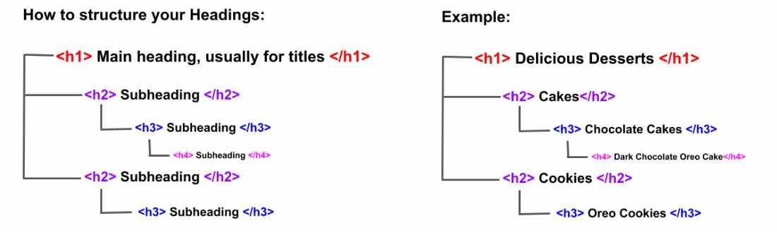
How to Fix This:
- Follow the Hierarchy: Always start with an H1 for the main page title, followed by H2s for main sections, H3s for subsections, and so on.
- Keep It Logical: Don’t skip heading levels for aesthetic reasons. If the text looks too large, adjust the CSS, but keep the heading level intact for semantic structure.
Step 8: Minimize Motion and Automatic Media
Why It Matters:
Unanticipated music, excessive animations, or automatically playing videos can disorient or even cause distress for some users. It’s crucial to provide controls for any moving, blinking, or scrolling content that starts automatically and lasts longer than five seconds.
How to Fix This:
- Provide Controls: Ensure all media has pause, stop, or hide controls.
- Don’t Auto-Play: As a general rule, refrain from auto-playing media with sound.
- Consider a Motion Reduction Option: Some users are sensitive to motion. Consider providing an option to reduce or eliminate animations.
Step 9: Optimize URL Slugs
Why It Matters:
URLs aren’t just for machines; they’re for humans too! A well-crafted, descriptive URL provides users with context about the page content, aids in SEO, and contributes to a positive user experience.
How to Fix This:
- Keep It Descriptive: URLs should accurately reflect the page content. For example,
www.example.com/accessibility-guideis much more meaningful thanwww.example.com/page123. - Avoid Unnecessary Complexity: Simplify URLs by avoiding unnecessary parameters and code.
Step 10: Design Accessible Forms
Why It Matters:
Forms are a common feature on websites, whether it’s a contact form, a signup form, or a checkout form. When forms are not designed with accessibility in mind, they can create barriers that prevent users from completing their tasks.
How to Fix This:
- Use Descriptive Labels: Each form control should have a corresponding label that clearly describes what is expected from the user.
- Provide Error Messages: When input is incorrect or incomplete, provide clear error messages to help users understand what needs to be fixed.
- Group Related Form Controls: Use fieldset and legend elements to group related form controls. This helps screen reader users understand the context of the form controls.
Let’s talk about a simple newsletter signup form. Let’s consider the initial code looks something like this:
<form>
    <input type="text" id="email">
    <input type="submit" value="Sign Up">
</form>
In the above example, there’s an input field for the user to enter their email address, but it’s not labeled, which means screen reader users won’t know what information is expected.
Let’s transform this to make it more accessible:
<form>
    <label for="email">Email Address:</label>
    <input type="email" id="email" required>
    <input type="submit" value="Sign Up">
</form>
Here’s what we changed:
- Added a Label: We’ve added a
<label>element that clearly describes the expected input – an Email Address. Theforattribute in the label corresponds to theidof the input field, creating a programmatic association between the two. - Specified Input Type: We changed the type of the input field from “text” to “email”. This ensures that assistive technologies and mobile keyboard settings treat the input field as a specific email field.
- Added Required Attribute: The
requiredattribute indicates that a field must be filled out before the user can submit the form
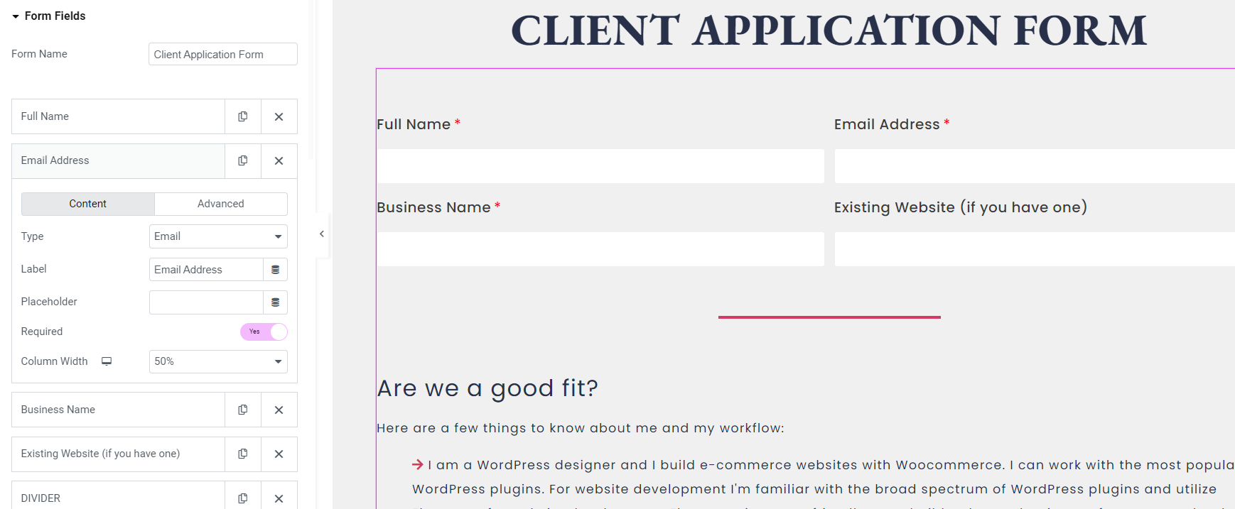
Page builders like Elementor automatically generate the necessary HTML behind the scenes based on your inputs, which makes creating accessible forms much more user-friendly. Remember, the main aim is to ensure each input field has a descriptive label and that required fields are clearly indicated.
Conclusion:
In this blog post, we’ve navigated the world of accessibility together, highlighting its significance in the digital age. We’ve embarked on a journey, laying out a roadmap for creating a website that’s a welcoming space for everyone. While there are a lot of things that you need to consider when creating an accessibility-compliant website, these serve as a good starting point. As you move forward, let these principles guide you, prioritizing accessibility in your online journey.
Want to learn more and take action? Making your website accessible doesn’t have to be a daunting task. At Launch & Elevate, we offer strategy consultations with accessibility being one of our key offering points.